
THE IMPORTANCE OF COLOUR IN WEB DESIGN
Apr 08, 2014
Have you ever thought about how colour affects the way you react? It’s not something I’d put a lot of thought into until I started working for a design agency, but it’s amazing how a particular colour can make you feel a certain way.
Take red, for example. When you see a red stop sign, you are induced to stop. And the red “Sale” banners in a shop window draw you inside (or push you far, far away, depending on how you feel about shopping!) Red is an active colour, causing excitement and a sense of urgency. That’s why you’ll find a lot of red lighting in the casinos of Las Vegas – it encourages customers to gamble more.
When you are choosing colours for your website, it’s not just about picking your favourite colour and assuming your website visitors will love it too; it’s important to take into consideration the type of business that you are, and the reaction you’d like to get from your visitors.
Colour Groups
Colours tend to fall into three basic groups: warm, cool and neutral. Warm colours are associated with enthusiasm and power, and can evoke a range of active emotions. Cool colours have a calming, peaceful effect, and neutral colours are somewhere in between – they work well if you want to draw the eye away from design and onto your products.
Warm Colours
Red – Excitement, Power & Desire
Orange – Confidence, Creativity & Warmth
Yellow – Optimism, Warmth & Happiness
Cool Colours
Blue – Honesty, Stability, Trust & Confidence
Green – Harmony, Nature, Peace & Health
Purple – Beauty, Inspiration & Wisdom
Neutral Colours
Black – Elegance, Sophistication & Mystery
White – Purity, Simplicity & Sterility
Grey – Calm, Understated & Subtle
If you want a balanced feel to your website, avoid lots of warm colours, and perhaps pair a warm colour with a cool or neutral colour. Or if you’d prefer to go for a luxurious, modern look, neutral colours can achieve this.
3 Real Examples
Warm Colours – Coca Cola UK
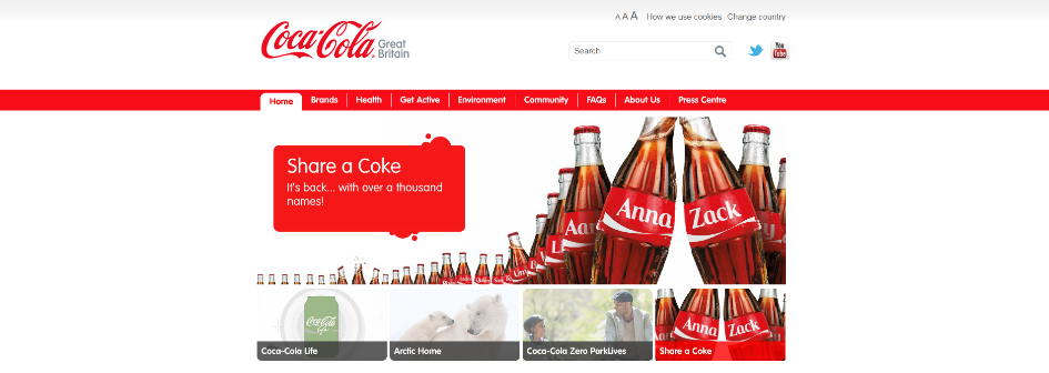
Although a lot of white is used in this website, this makes the iconic red in Coca Cola’s logo, banner and headings stand out even more.
Cool Colours – O Green (Nestle)

This immersive design promotes the calming effects of Nestlé’s new Apple and Cucumber tea with a cool green colour palate.
Neutral Colours – The Windmill Club
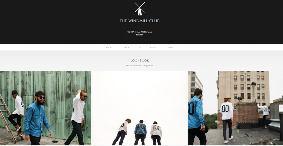
The black and white theme in this website reflects the stylish simplicity of the menswear it sells.
Hopefully you’ve found this post about colour useful – do get in touch with your comments or feedback below!
Add Pingback