3 THINGS WE CAN LEARN FROM INSTAGRAM’S NEW WEBSITE DESIGN
Jun 11, 2015
INSTAGRAM ANNOUNCED A REDESIGN OF THEIR DESKTOP WEBSITE THIS WEEK, WHICH IS NOTICEABLY MORE MINIMALISTIC THAN ITS PREVIOUS DESIGN. IT ALSO SHINES A SPOTLIGHT ON WHAT INSTAGRAM IS FAMOUS FOR: IMAGES.
This new website clean-up from Instagram can teach us three important lessons about how businesses should approach web design and online marketing:
1. QUALITY IMAGES ARE A BIG DEAL
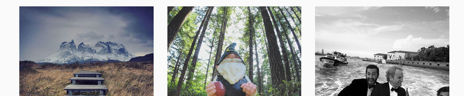
The images on Instagram’s new design are much bigger than before, with three images displaying per line rather than five. Their effort to make more of beautiful photography speaks volumes about how web users respond to imagery online. When it comes to images on your website or social media platforms, take care about the quality of the images you are using.
2. LESS IS MORE
Instagram’s old website could not be described as cluttered, but even so, its decision to remove the rounded edges and borders gives an insight into where web design is heading. In an age where web users want to find information fast, it’s miles better to have a simple, non-fuss website. Resist the temptation to add all those widgets!
3. START USING INSTAGRAM IF YOU ARE NOT ALREADY
The final lesson we can learn from Instagram’s web design is that we should be using it more! The new design just shows how popular the platform is for businesses and individuals all over the world. Instagram is a fantastic way to show off your business, whether you sell beautiful products, are constantly on the move, or you spend lots of time in an office. If you don’t have an account we recommend setting one up soon.
We'd be happy to help if you would like advice setting up Instagram for your business!