Food for Thought: Colours and their Relationship with Brand
May 12, 2017
Colour is an integral part of branding. It conveys the tone and mood of your business in the most visual way. Colour is the first thing a consumer will notice about your logo; people are acutely aware of whether or not a brand and logo colour really connects. Studies have shown that a product’s colour influences 60 to 80 percent of a customer’s purchasing decisions, meaning colour can make or break a product.
In this post we are discussing what brand colouring really says about your business, giving you tips and advice on how to use colours to give the impression you want.
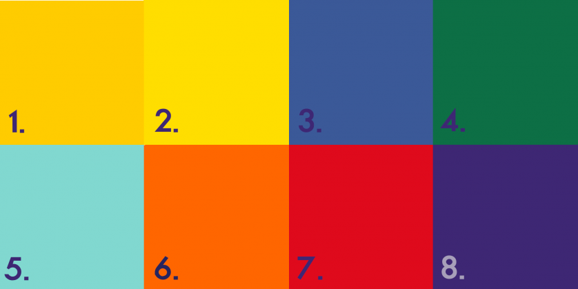
Case Study: Mini Game: What colour relates to which brand?
(Answers will be at the bottom, no peeking!) Hopefully, you get most of them right because this game is meant to prove how a colour can be married to a brand so much so that it’s instantly recognisable just by a colour, with no need for the rest of the brand logo. That’s when you know you’ve picked a great colour!
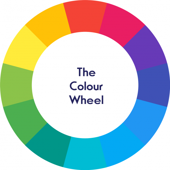
Colour Codes: What do certain colours mean?
Colours can be split into two umbrella categories; warm and cold. Warm colours are associated with energy, whilst- cold colours identify more with calmness and security.
- Red – It raises your heart rate, making you breathe more rapidly. It evokes a passionate and visceral response. Code for: Aggression, Energetic and Attention- Grabbing
- Yellow- Relationship with the Sun causes this colour to communicate hope and optimism. Stimulating creativity and energy, its brightness is useful in catching a client’s eye. Code for: Positivity, Motivation and Warmth.
- Orange- Combining both the brightness of yellow and the energy and boldness of red makes orange a colour full of life and excitement. Code for: Fun, Playfulness and Exuberance
- Green- Calm, freshness and health are synonymous with this colour. The shade will change the meaning, with deeper shades associated with affluence and lighter greens with serenity. Code for: Wealth, Health and Serenity.
- Blue- Is thought to put people at ease with its relationship with the ocean and sky. This is why it is the most popular choice for a brand colour. Code for: Dependable, Secure and Responsible.
- Purple- Sophisticated yet a mysterious colour. Purple was hard to come by and was only produced by crushing a certain beetle, causing it to have an air of luxury. Code for: Royalty, Spirituality and Nostalgia.
- Brown- We’d suggest using with caution as although it has earthy connotations it also reminds people of dirt. Code for: Natural, Simplicity and Durable.
- Black- It’s a classic and works well for expensive products. Code for: Value, Timelessness and Prestige.
- White- A popular choice for health care as it synonymous with cleanliness. Code for: Pure, Clean and Soft.
Top Tips
- Integrate, Integrate, Integrate…
The number one top tip is to make sure your brand colours are integrated across the board; your logo, landing page, product and more. This will help achieve the highest impact, if not to tie everything together- think Cadburys purple and Coca- Cola’s red. Both brands have distinct colours that are recognised internationally by persistently using their chosen colours on everything.
- Don’t over Complicate
The number of colours is important to think about. Only 5% of companies use more than 2 colours in their branding with the other 95% only using one or two colours. Each colour gives off a certain vibe and feeling (we discuss this a bit later). So, you don’t want to over-complicate and send out mixed messages to clients. ‘Minimise to maximise!’
- Create a Colour Palette
You need to be original! Choosing a colour palette from scratch is important; with so many variations of each colour, there is no need to choose the same colour as another business. Create your own and have more of a chance of becoming a recognisable brand. A colour palette is essentially a series of five colours that are positioned next to one another to see how one looks like next to the other. Each colour needs to complement the other. Having five colours allows for you to assign a colour to font, headings and links on your websites alongside your main logo. For inspiration on colour palettes check out – ‘COLOURLovers’ or ‘Colour Collective.’
It costs your company next to nothing to choose a colour, but making the wrong decision could cost your company in the long run. So, be precise and think carefully about what your company stands for and relate it back to colours. We wrote a post on ‘The Importance of Brand Building’ which may be of use to you if you are in the process of creating a brand. Or if you have the brand and have chosen your colours but need help implementing it in a website or logo design, we can help here at The Creation Lab, give us a ring on 0800 644 7070 we’d be more than happy to help you!
Answers:
1. McDonalds
2. Selfridges
3. Facebook
4. Starbucks
5. Tiffany & Co
6. EasyJet
7. Coca-Cola
8. Cadbury
(Let us know how many you got right on Twitter, @thecreationlab)
Add Pingback